Client: School Project
Project Type: Interface Design
Compentencies: UX/UI Design
Softwar: Figma, Photoshop
Overview
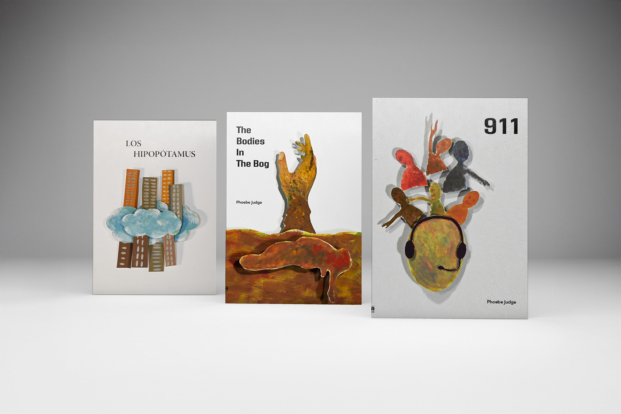
For this project, I selected three the criminal podcasts, analyzed their narratives and tonal qualities, and designed corresponding book covers that visually communicate each show's identity. By considering composition, color palette, and typographic hierarchy, I aimed to create designs that are not only aesthetically engaging but also enhance the viewer's understanding of the podcast's theme.
Design Explorations
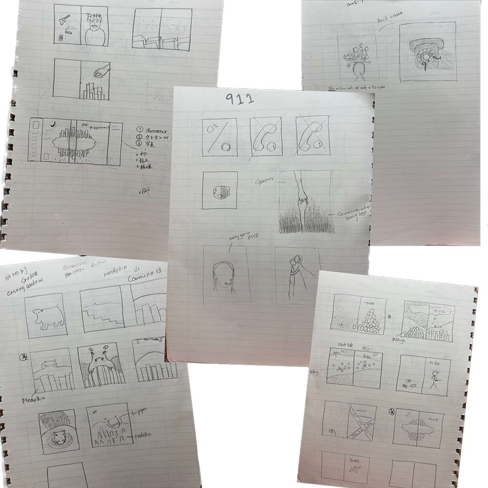
I listened to each podcast and sketched an initial concept, then realized it digitally. I applied the same iterative design process for the second and third projects, refining each cover based on thematic and visual considerations.
Challenge
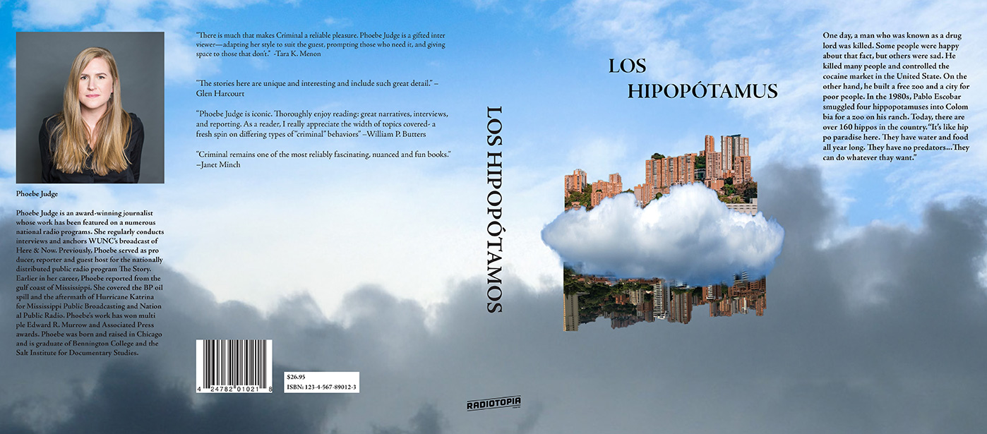
The challenge of this project was to design a book cover that engages the viewer and sparks curiosity, while maintaining an element of mystery. By carefully considering composition, color palette, and typographic hierarchy, I aimed to create a visually compelling design that conveys the essence of the story without revealing it entirely at first glance.
Solution
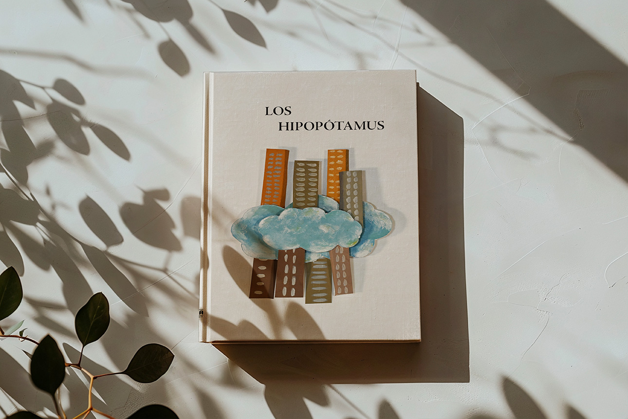
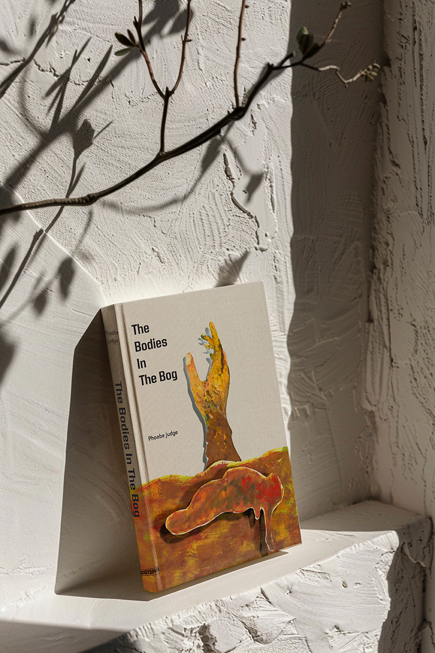
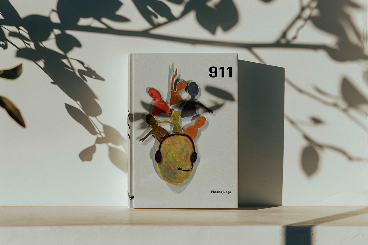
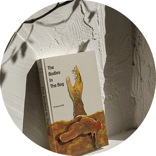
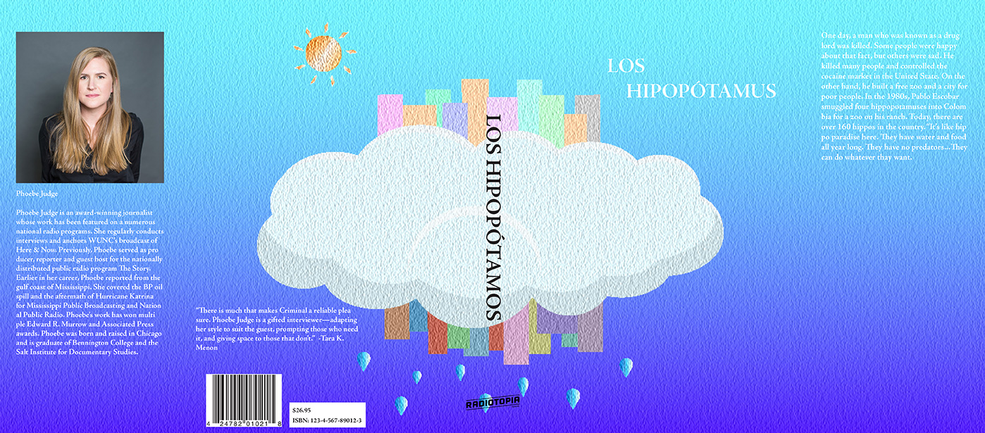
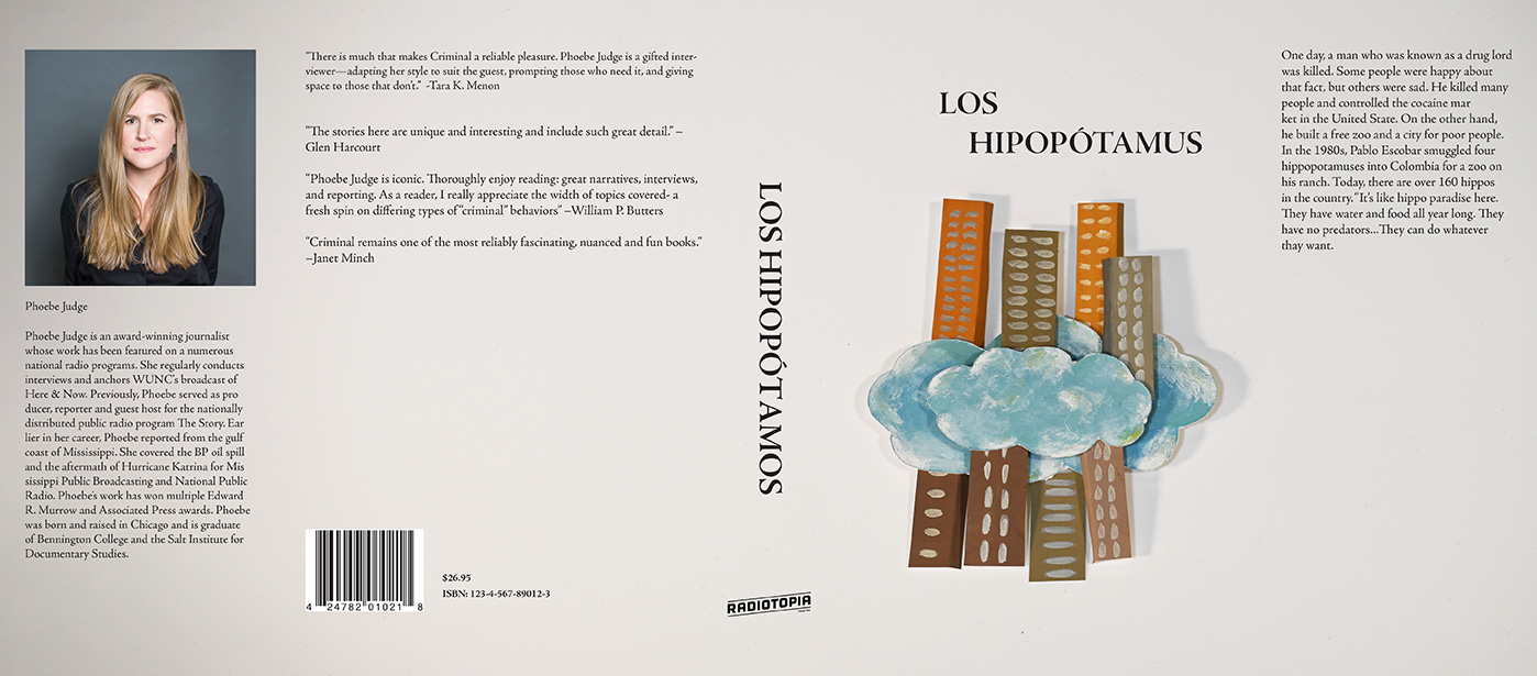
In the first film, the two sides of Pablo Escobar were expressed in the city of Medellin. Secound one shows the murdered mummy with his hands up as if to let us know where he is. Third one shows a 911 operator who receives rescue calls from many people every day. The top is the person who made the call. Many 911 operators suffer from PTSD because of their job. Operators help many people every day.
The Final
For the book Los Hipopotamaus, I created three different book covers using Illustrator, Photoshop, and Glossier Paint, cutting them out, layering them, and taking photos. I ultimately chose the Paint one, and have since created two more with the same concept.